While Americans on the East Coast are battling a bomb cyclone, a recent NASA image shows quite a different weather scenario out West—one bathed in excessive heat. Comparing the current scenario to the past eight years—which is exactly what this striking new image does—shows just how drastically the weather has changed.
The image was taken by NASA's terra satellite and is based on data from the Moderate Resolution Imaging Spectroradiometer (MODIS), an instrument onboard the satellite that takes readings of the Earth's surface. To create the visual map, NASA used land surface temperatures from December 26, 2017, to January 2, 2018, and compared these with average temperatures of the same time period over the past eight years ago.
Red represents areas that were hotter than average and blue areas were colder than average. (White represents normal temperatures and gray represents inadequate data.) The vast amount of color on the map show just how distinct this year's temperatures are compared to that of the past.
Related: What Is A Winter Hurricane?
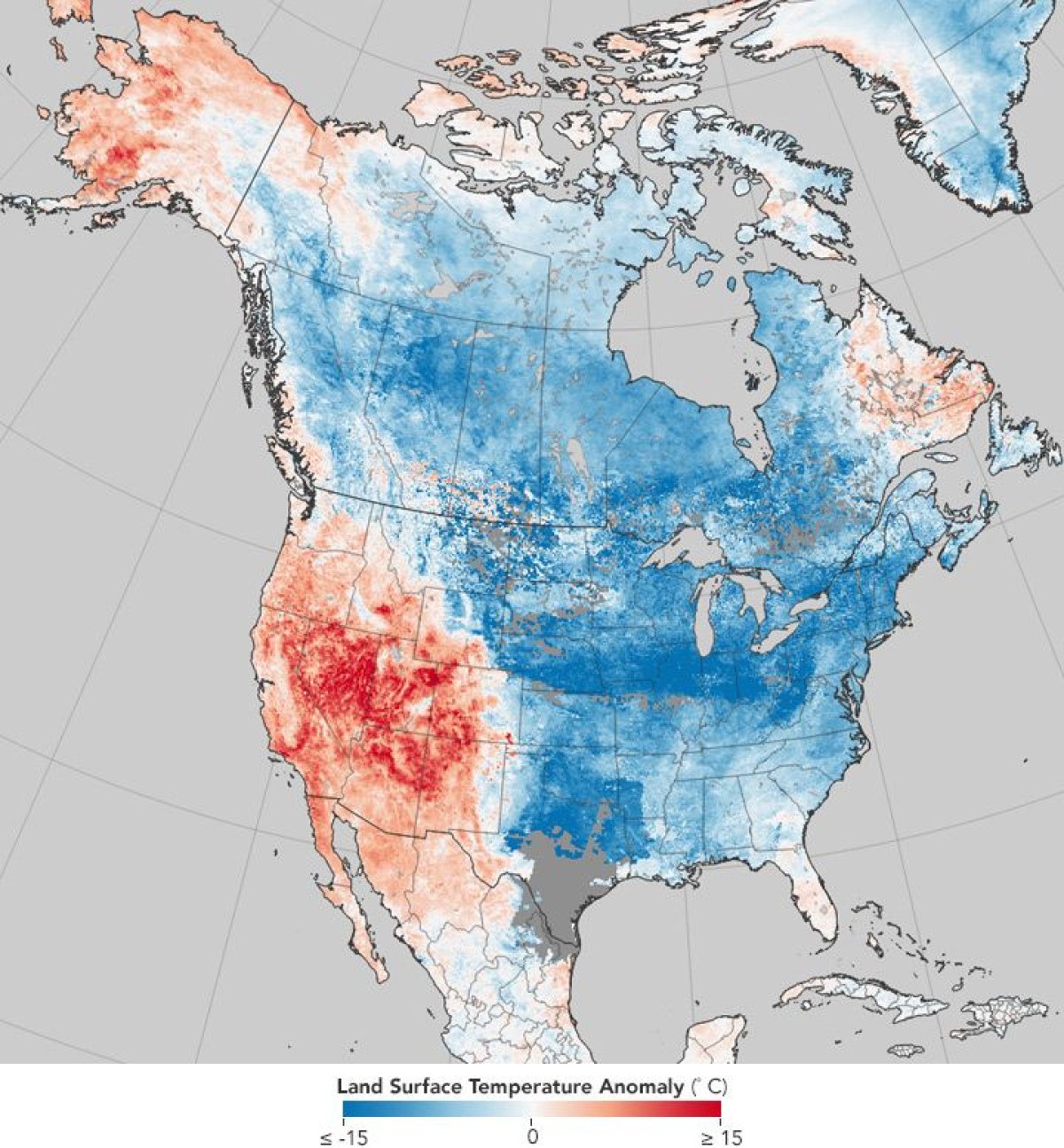
NASA emphasizes that the map shows land temperatures, not air temperatures. Because land temperatures can be significantly different than the actual temperature of the air, they aren't the most accurate representation of global temperatures. Still, land temperatures can be useful. Surface temperature maps are especially helpful in predicting how much heat or cold stress may affect crops, NBC Los Angeles reported.
Related: Frozen Bomb Cyclone Set To Hit East Coast
The map may look harrowing, but NASA reported that the drastic differences in weather on the U.S. coasts can be explained by regular weather patterns. For example, a jet stream of air called the Rossby wave connects U.S. air streams on the east and west coasts. This wave dragged warm tropical air into the west, but the Rocky Mountains blocked it from mixing with far cooler air on the East Coast. As a result we have strikingly different temperatures on both sides of the country.
Still, the map is a rudimentary representation of how temperatures in the U.S.—as well as the global average temperatures for January and December—have changed in less than a decade.
SaveSave
Uncommon Knowledge
Newsweek is committed to challenging conventional wisdom and finding connections in the search for common ground.
Newsweek is committed to challenging conventional wisdom and finding connections in the search for common ground.
About the writer
To read how Newsweek uses AI as a newsroom tool, Click here.