


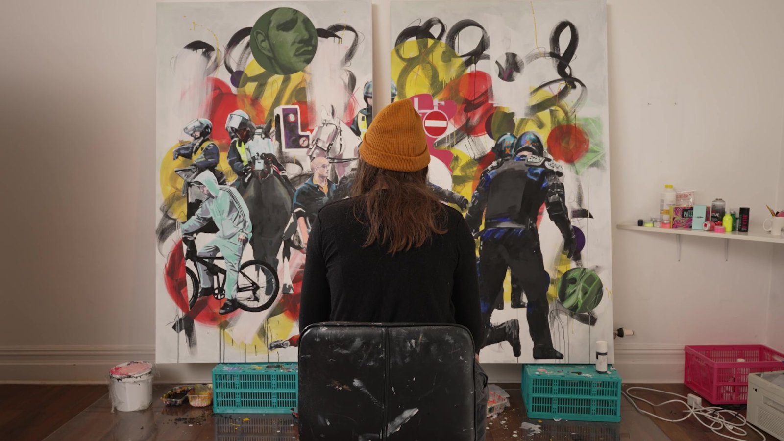
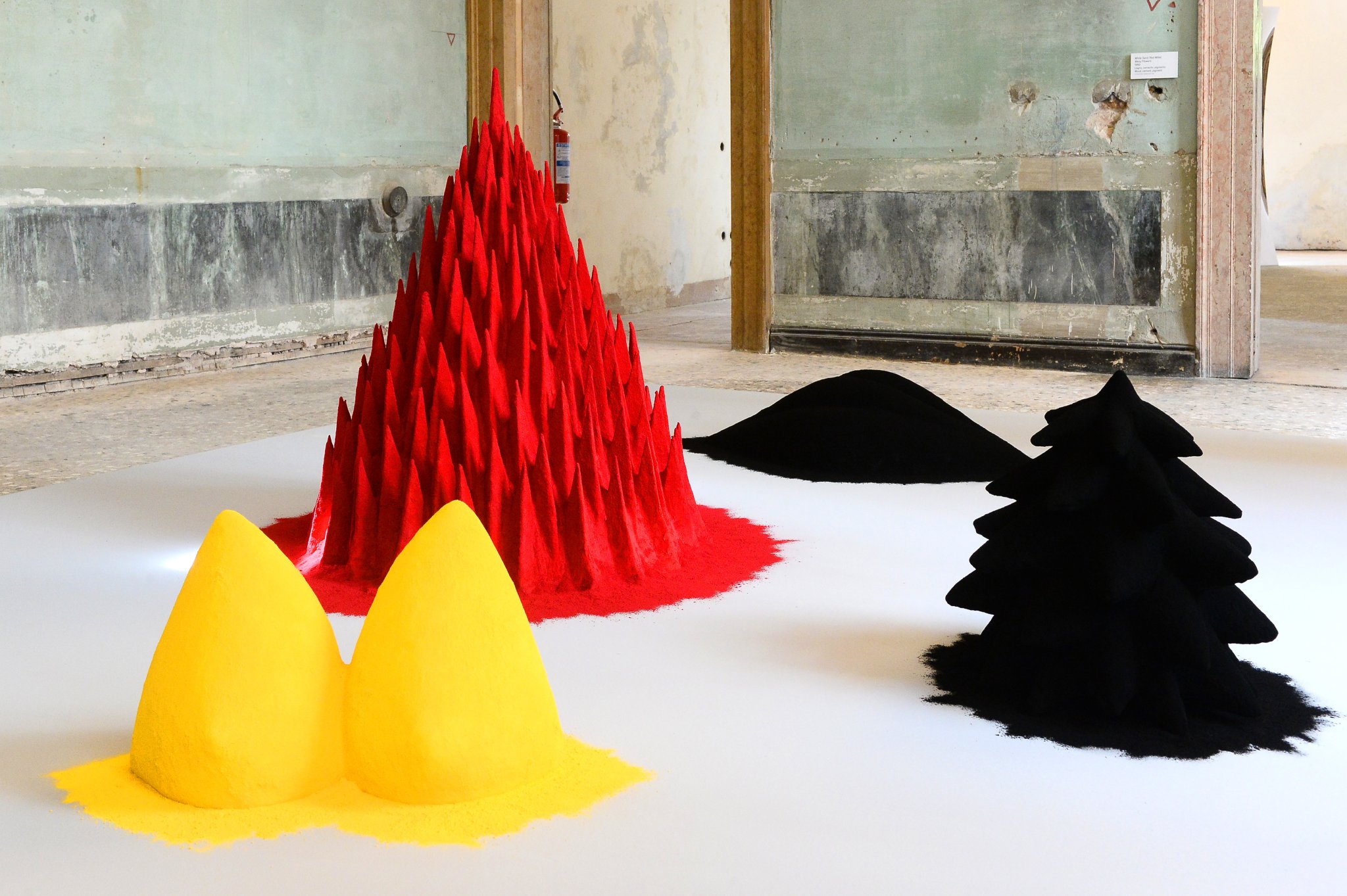
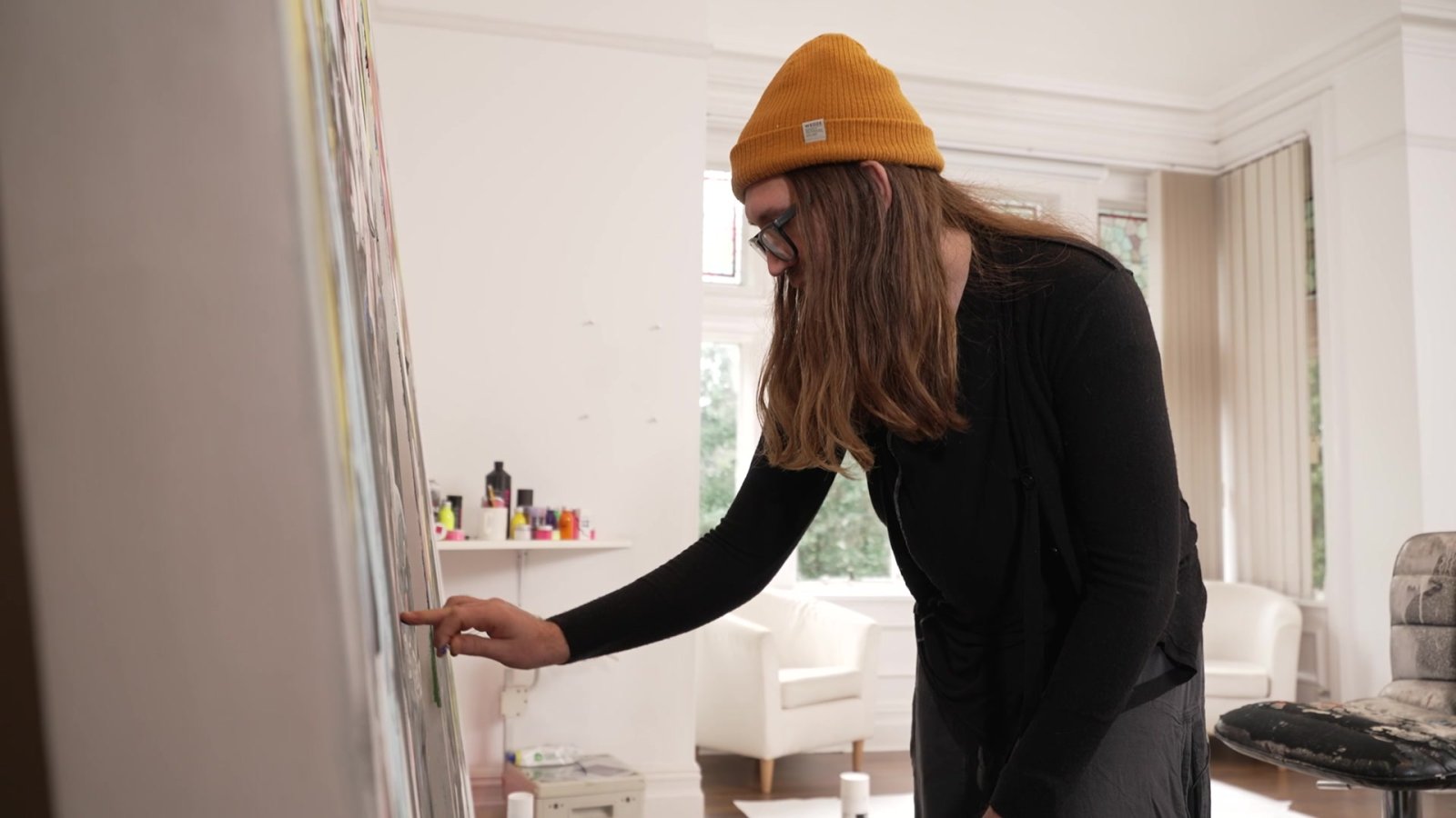
Stepping into Stuart Semple’s world is like entering a Willy Wonka-esque fantasyland. Only instead of chocolate and candy, everywhere you look there are bags of bright powdered paint pigments, colour-mixing machines, paint-spattered canvases, sculptures, brushes and of course, brightly coloured bottles of paint.
The man himself bustles around with a giddy sort of energy, clad in furry animal slippers, with long hair and perpetually paint-stained fingers, a visual reminder of his love affair with colour.
“I would explain colour as something that can change our emotions and our state and way of being as we interact with that. And it is a way, really, of feeling the world inside us visually.”
To see him, you’d never think Semple is anything other than a creative type. You certainly wouldn’t peg him as a political crusader. But when someone threatens what he sees as a universal right to artistic self-expression, a different picture emerges.
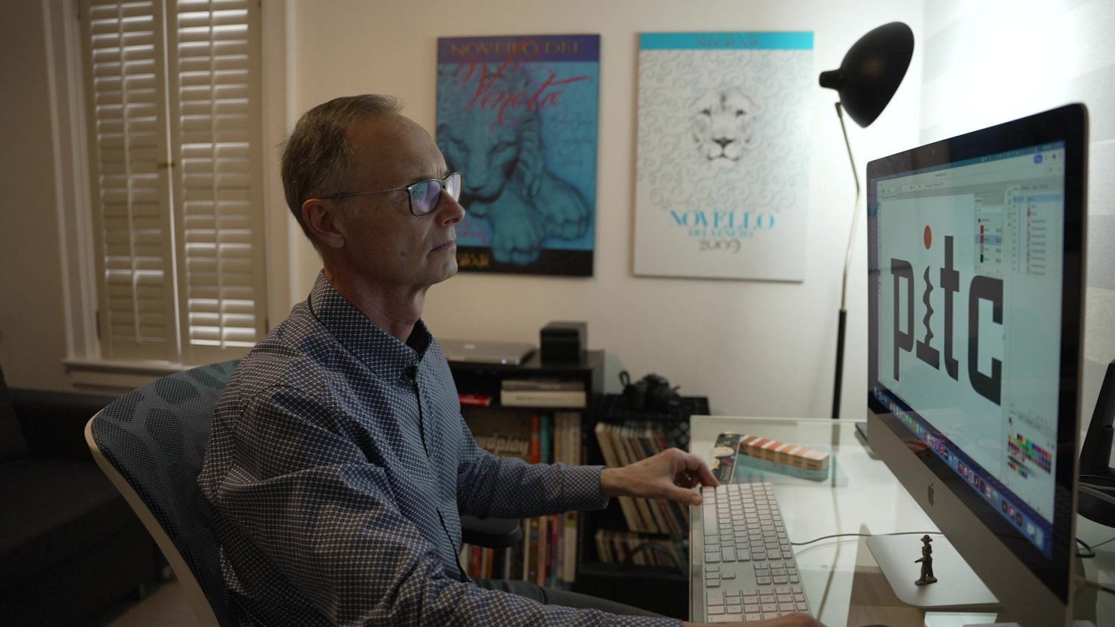
Sitting in his studio on England’s south coast, Semple is looking at a popup message on his computer screen, brow furrowed.
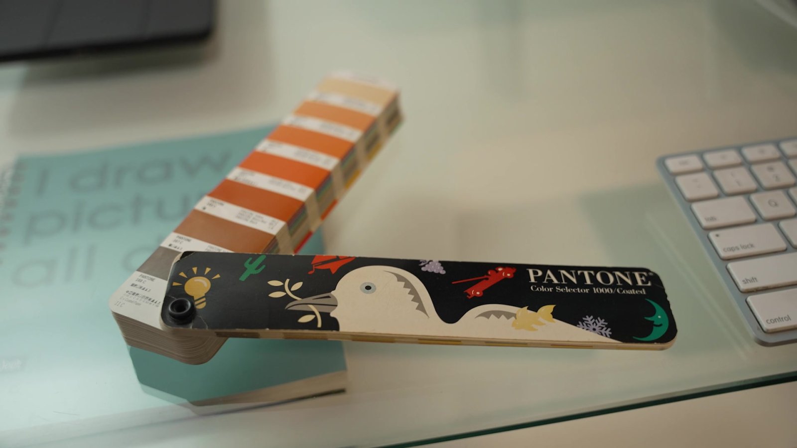
“Some Pantone colours may no longer be available due to changes in Pantone’s licensing with Adobe.”
In November, creators saw a similar message pop up in their Adobe software, meaning colours they’d previously been able to access were no longer available. Adobe is the industry standard for digital artists all over the world, and Pantone supplies many of the digital colour palettes.
Semple immediately saw red.
“I couldn’t believe it,” he says. “I think they’re (Pantone) just trying to milk the creators that use their tools for more money.”
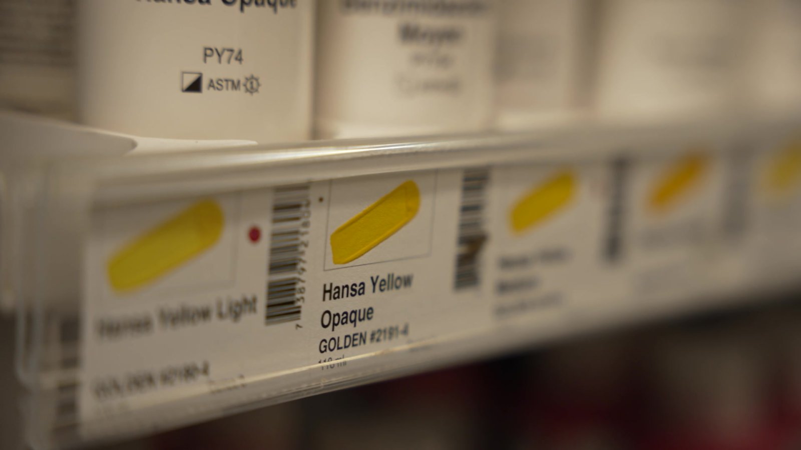
Pantone’s palettes are the international language of colour. The company’s colour coding system is nearly universally used to match shades and allow printers to accurately reproduce computerized artwork across the globe. But all of a sudden, many of the colours artists rely on were jailed behind an additional paywall.
“I think that there’s a difference between being a business and being commercially minded and paying your staff and keeping the lights on, to actually just seeing how much you can squeeze out of people, and it feels like that’s what they’re doing.”
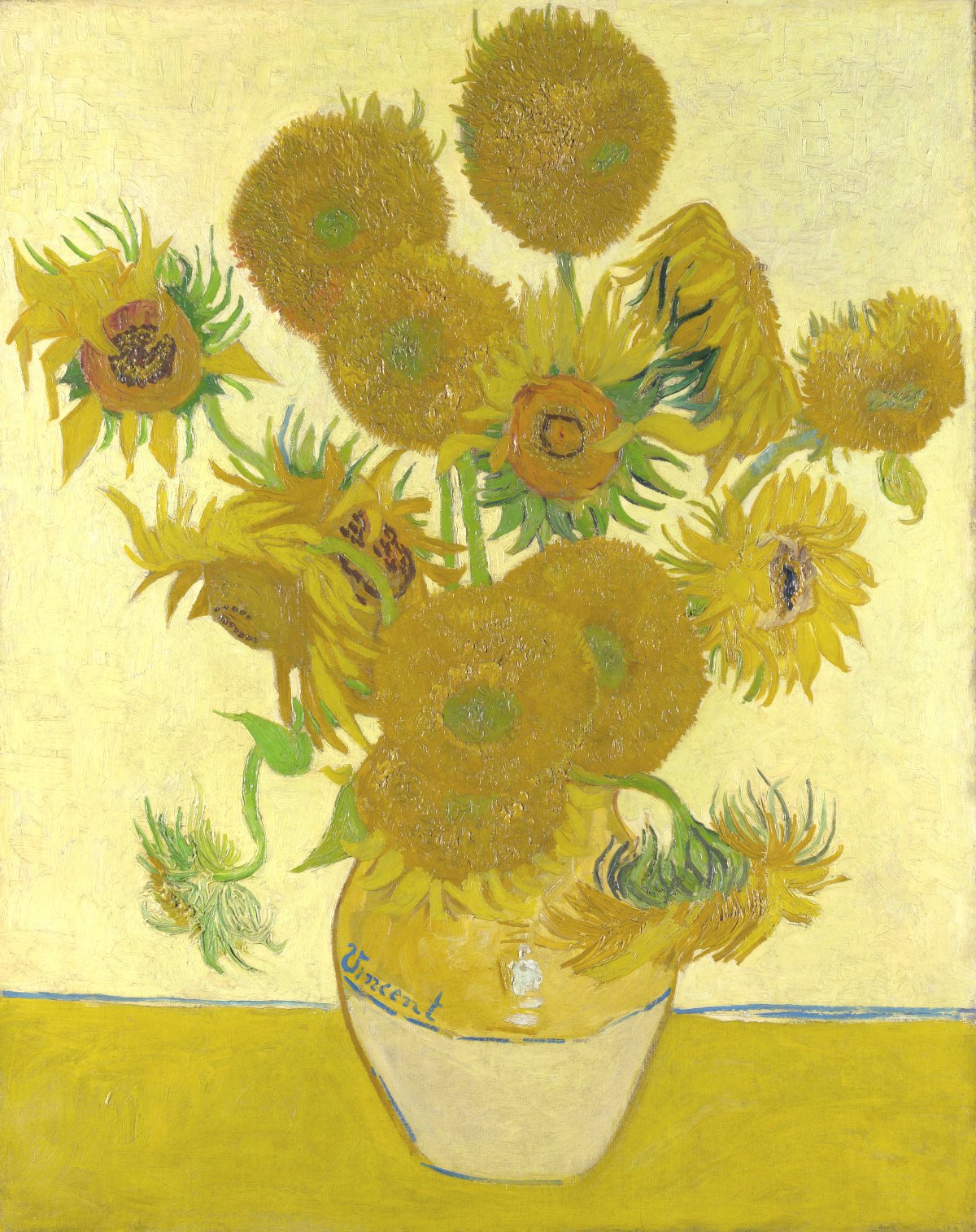
Semple’s reverence for colour and art goes back to his childhood. He grew up in a modest, working-class family. A high achiever in school, he was destined for a high-paying career as a doctor or lawyer. But a trip to the National Gallery in London when he was eight years old lit a creative fire.
“I came in contact with Van Gogh’s Sunflowers and it made a huge impact on my whole life and it sort of burned into my head,” he says.
“And my mum said I was in a state of almost awe, like I was shaking in front of this thing.”
The young Semple got home and immediately started creating. He couldn’t afford professional paints, so he made them himself with household materials.
“We didn’t have art materials. I mean, that was a luxury. So I started, like most kids do, going into the kitchen and mixing food colouring with, you know, beetroot and cooking oil and making these colours and slapping them on things.”
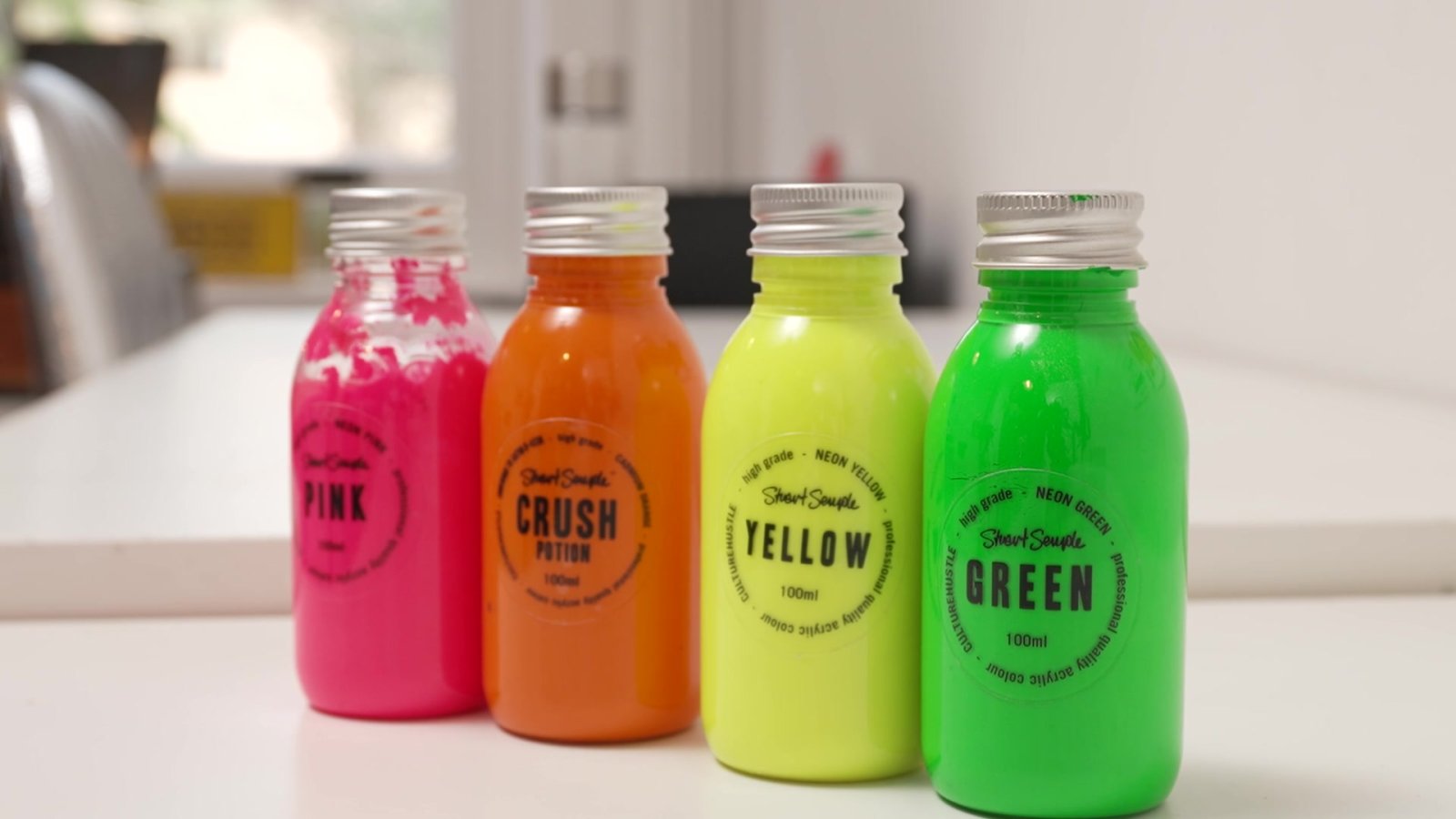
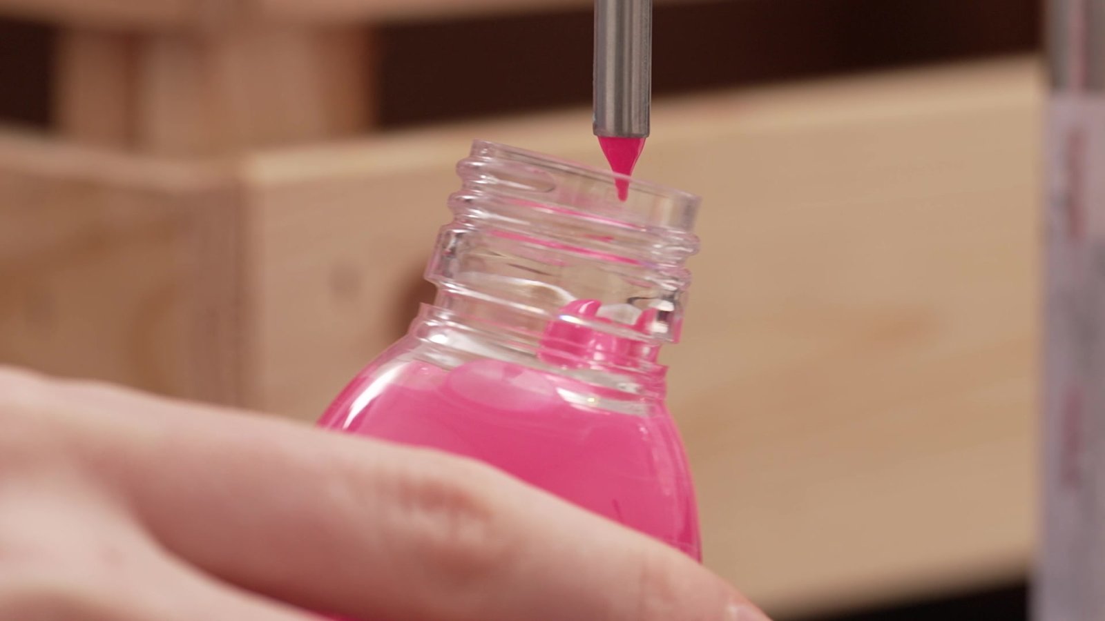
Today, Semple is a successful artist, and he hasn’t lost his passion for producing pigment. He still makes his own shades of paint. Mixing up an extremely bright shade of pink — he calls it the Pinkest Pink — the childlike wonder is still there.
“Aww! There’s something so satisfying about it,” he giggles, dumping in the powdered paint pigment and watching it swirl around the mixer.
He knows the science, obsessing over details to make his paints pop.
“By using resins that can hold a lot of ingredients, you can put a lot more ingredients in, which means you can actually put more pigment in,” he says. “And it’s all to do with the shape of the pigment because a spherical shape will reflect light in a very direct angle from one small bit of surface area, whereas a flatter pigment will do the opposite.”
But there’s something much larger at play here. What makes Semple’s studio truly special is the philosophy behind the operation. Art is an expensive endeavour, often only open to the wealthy. Semple’s own experience is one factor that drives him to help make art affordable to both patrons and creators. He makes high-quality paints he sells at reasonable prices.
“So it’s more than, how do I make money? It’s actually more, how do I make art accessible and give people, you know, the chance to interact with it?”
That’s just one part of the operation. Semple employs 20 people, all of whom are artists. He gives them free access to materials, studio space, tools and mentorship to support them to create their own works of art. Semple also founded the “Giant” art gallery in his hometown of Bournemouth, which offers free admission, and the online VOMA gallery (Virtual Online Museum of Art). Just as he believes art should be for everyone, he says that the colours all around us should be free to enjoy and inspire creativity.
That’s what made him so mad about Adobe and Pantone restricting access to colours that had been free for years.
“We all consume colour all day long, so we’re all invested in it,” Semple says. “So it actually does really, really matter. And as these corporations get big and become mega-corporations, the idea that we have a culture that is being dominated by the richest and most powerful and they can actually control the colours that we see is outrageous.”
Across the Atlantic ocean in Toronto, graphic artist Daryl Woods got the same message Adobe users everywhere were seeing: if he wanted access to the same range of Pantone colours he’d had for years, he’d have to pay extra, over and above the $80 per month he already pays for his Adobe software subscription.
“I think this is pretty much a cash grab by Pantone. This is something that’s been available for probably a couple of decades at least,” Woods says.
Woods has a graphic design business, creating art for advertisements and for packaging on brands, like wine labels. And he says most digital artists rely on Adobe software and Pantone’s colour palettes.
“I can’t do my work without the Adobe products. They are just part of my everyday life. And I think that pretty much goes for anybody who works in visual communication.”
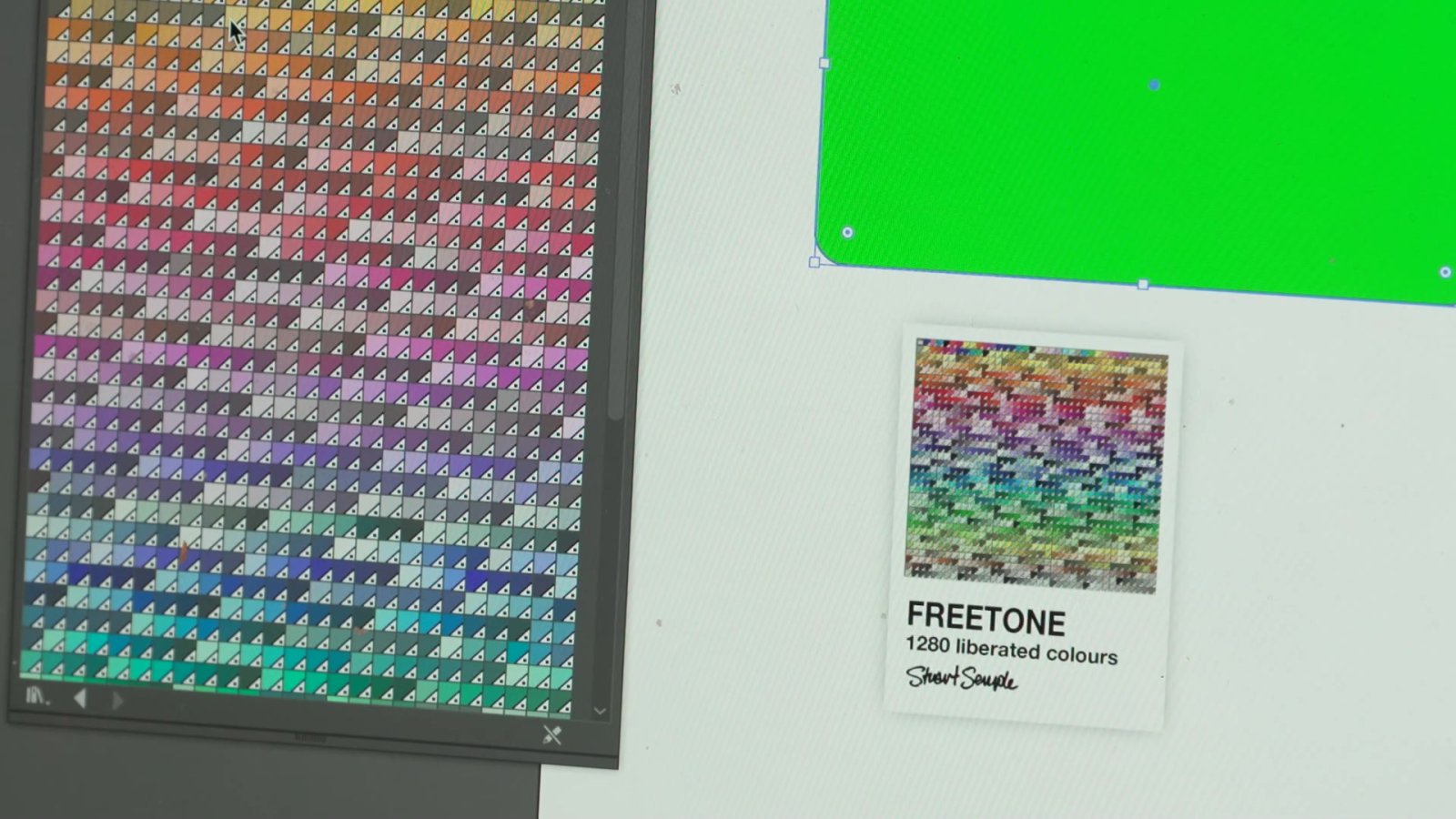
Semple decided to do something about the new fee. In just a few hours, he created a software plug-in for Adobe that had colour palettes that he describes as “indistinguishable” from Pantone’s. He calls his “Sempletones.”
“One of the things that people don’t know is that I learned how to program a computer when I was eight,” he says casually. “So coding and computers are a huge part of my life. And yeah, I can do things like that.”
So why did he do it?
“I hate the idea that art or colour or materials are sort of gate-kept, in any way, shape or form,” Semple says. “I really think it’s important that people have that permission to kind of do their thing with the stuff they need to do it.”
Woods was impressed Semple was able to come up with a workaround so quickly. “I was very surprised at how easy it was to work with how complete it was. It’s no different than when I used Pantone colours.”
Global News reached out to Adobe and Pantone for comment. Adobe responded that it was Pantone’s decision to charge an additional fee to access its complete range of colours, and that “the Adobe team continues to find ways to lessen the impact on our customers.”
Pantone did not directly address the question of who was responsible for pulling some of its colour palettes, but the company is now selling a separate plug-in with the missing colours directly on its website at a cost of $19.99 per month or $119.99 per year.
For Semple, the Adobe-Pantone affair was just the latest battle in a long-running colour crusade.
In 2016, he got into a very public feud with Anish Kapoor. He’s the British artist perhaps best known for “Cloud Gate,” sometimes better known as “The Bean,” a public art installation at Chicago’s Millennium Park.
In 2016, Kapoor bought the exclusive artistic rights to Vantablack, a material then known as the world’s blackest black. Vantablack absorbs 99.965 per cent of visible light, creating the impression of complete dark, flatness.
Semple criticized Kapoor for keeping the material for himself, and in response, decided to sell a special shade he made called “The Pinkest Pink.” He made it available for purchase on his website, with one caveat: “By adding this product to your cart you confirm that you are not Anish Kapoor, you are in no way affiliated to Anish Kapoor, you are not purchasing this item on behalf of Anish Kapoor or an associate of Anish Kapoor. To the best of your knowledge, information and belief this paint will not make its way into the hands of Anish Kapoor.”
Semple’s efforts to keep colour accessible during the Adobe/Pantone episode, as well as his response to Kapoor’s attempts to keep Vantablack for himself, have earned him comparisons to Robin Hood.
“People say that. It’s a weird thing,” Semple says self-consciously, before adding: “Maybe it’s just a weird, geeky thing that only I’m interested in, which is why no one’s doing it. But I really enjoy doing it. It’s something I love to do.”
Kapoor’s response was, perhaps, a little less than collegial. He posted a simple, terse retort on his Instagram, a middle finger, dipped in Semple’s pink paint.
But that episode wasn’t just a petty slap fight between two rivals within the narrow confines of the art world. Just as charging Adobe users extra to access some of Pantone’s range of colours wasn’t just a small extra charge. It’s all part of a larger trend to commodify colour.
In 2019, Canada’s trademark laws were updated to allow businesses to trademark colours closely associated with their brands. Tiffany & Co, the jeweller known for its iconic robin’s egg blue box, is often cited as an example.
“So historically, you could claim a Tiffany blue box,” says Toronto intellectual property lawyer Sebastian Beck-Watt. “So you would say the colour blue, as applied to the surface of a box. And then you would say, I’m claiming this trademark in association with jewellery, for example.”
But in 2019, Canada followed other countries and updated its trademark law, allowing brands to trademark colour “per se.” That allows businesses to trademark shades associated with their brand across a more general range of products and services they offer, and stop industry competitors from using similar hues.
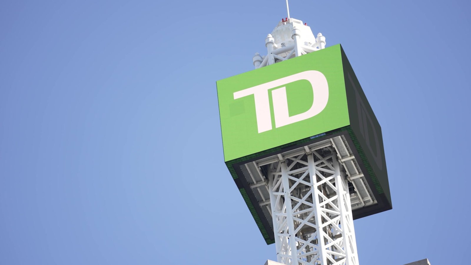
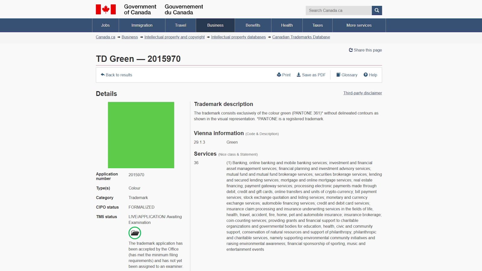
TD Bank has applied for the trademark for the green colour associated with its brand, Pantone 361. TD lists a range of products and services, and nobody knows how far companies might go to protect a colour trademark. But we have a hint from other countries.
In 2019, the parent company of mobile giant T-Mobile sued Lemonade, a small insurance company which had just launched in Germany. The parent company, Deutsche Telekom, claimed Lemonade used a shade of pink that was too close to its familiar magenta, or Pantone Rhodamine Red U, and that its trademark over similar shades extended to Lemonade’s insurance business. European countries have allowed businesses to trademark colours before Canada, and Lemonade was forced to remove the pink from its branding in Germany.
In 2020, however, Lemonade won a court challenge in France, when a court ruled “there is no evidence of genuine use of this mark for the contested services.” But the case provides a cautionary tale, because it shows large corporations can drag smaller parties through costly court proceedings, even when they don’t have a valid claim.
It is also illustrative of the subjectivity of colour. How will courts determine when two shades of the same colour are too close to tell the difference? Beck-Watt says there’s no way of knowing how far it will go until the laws are tested in court.
“Something like colour might be an instance where you take a survey of the public and see how close they think these are.”
Determining matters of law so subjectively raises another issue: people’s brains do not process colour in the same way.
“I’m colour blind,” Semple says, without a hint of irony.
Really?
“Yeah, actually. Colour blind. Blue and purple. Which is a rare one.”
In spite of his inability to distinguish between some colours, Semple is fearless in his opposition to any attempt to control and restrict them. Tiffany has had a trademark for Pantone 1837 in the US since 1998. Semple responded by creating “Tiff,” a very similar shade of blue.
It all makes his lawyers nervous.
“They always say the same thing, which is that what I’m doing is risky. And I should be aware of that, you know.” But he has no intention of stopping
It could be called a principled stand, or perhaps brazen, almost reckless. But for Semple, it’s worth it. Art, he says, saved his life when he was in his late teens, when a sandwich triggered a severe allergic reaction and landed him in hospital.
“I kind of died for a few seconds, in the middle of the night. And I said goodbye to my mom and my sister, and my nana had been in. My whole body went into hives and I completely flatlined and kind of died for a bit. And then I came back and everything was different after.”
Art, he says, became a way of coping with the reality that everything could be taken away at any moment.
“It changed everything. So the first thing that happened, which is a bit of a cliche and a bit weird to say, is that I decided I wanted to be an artist. I was like, ‘If I live, I’m going to make art every day, all day.’”
That’s a big reason why Semple is so steadfast in his efforts to stop anyone from trying to “own” or restrict colours.
“No one can own colour,” he says pointedly. “Colour exists. It’s just a phenomenon of nature. How can you own an experience that your eyes have when they see something?”


Comments