It's been a bad year for hurricanes, but Earth's atmosphere is a complicated place and there are lots of pieces of the puzzle that could explain what made its storms so severe. That's why NASA's Goddard Space Flight Center wanted to put together an animation of how this year's hurricane season played out based on data the agency's satellites have gathered over the course of the year.
And the result isn't just scientifically valuable—it's also stunningly beautiful. The animation is based on three different types of aerosols, which is just a fancy science term for really small particles in the air. Some aerosols are naturally made—produced by volcanoes or picked up as the wind passes over a desert. Others trace their origins to humans, like smoke from fires. No matter how a particle of aerosol comes to be, its fate depends on where in the atmosphere it wanders.
The new NASA visualization focuses on three different types of aerosols: dust, smoke and sea salt. These particles allow scientists to paint with all the colors of the wind, since tracing where these visible particles journey shows where winds are blowing.
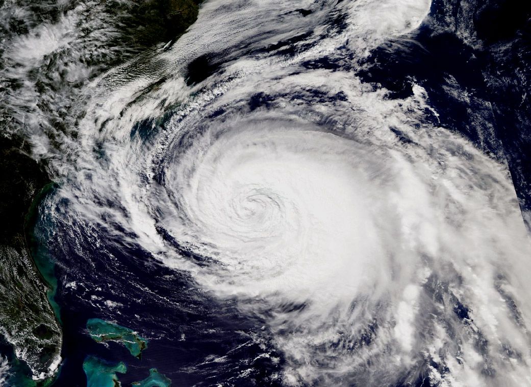
In the case of hurricane season, the interplay between different types of aerosols is particularly valuable information. Storms tend to be born in the eastern Atlantic, which happens to be an extraordinarily dusty area of atmosphere due to winds passing over the Saharan Desert.
Read more: First Hurricane Harvey, Now Irma: Is Climate Change to Blame for Destructive Storms?
But as the rain begins to fall, that dust falls as well, out of the clouds and into the ocean. It's replaced by sea salt particles picked up by the storms, which then trace the swirls of a hurricane moving across the ocean.
That dance between dust and salt is the star of the new NASA animation, as they paint first Hurricane Harvey, then the one-two punch of Irma and Maria, as well as smaller storms. It also shows differences between these storms, which crossed further west, compared to Hurricane Ophelia, which stayed further east and lost less of its dust, dyeing British skies at the time red. The animation is so detailed you can watch individual cloud bands rotating around each storm's eye.
But hurricanes weren't the only issues late this summer—the animation also shows the gusts of smoke created by wildfires in California, the Pacific Northwest, and Portugal. Just like dust and sea salt, that smoke was picked up and carried by winds until it fell out of the skies.
This sort of visualization is really difficult to produce: the agency says creating and running the model takes up millions of hours of a supercomputer's time. But in the long run, it's exactly that sort of work that will help improve our forecasts—which in turn can save lives the next time a storm hits.
Uncommon Knowledge
Newsweek is committed to challenging conventional wisdom and finding connections in the search for common ground.
Newsweek is committed to challenging conventional wisdom and finding connections in the search for common ground.
About the writer
Meghan Bartels is a science journalist based in New York City who covers the science happening on the surface of ... Read more
To read how Newsweek uses AI as a newsroom tool, Click here.