Coronavirus: The data suggests the UK is on course for many thousands of deaths
Sky's economics editor looks at the numbers to see what we can expect over the coming weeks - and he finds little comfort.

Wednesday 1 April 2020 13:09, UK
Let me preface this with a little disclaimer: I'm not a doctor or for that matter an epidemiologist, but I do know a little bit about presenting and explaining data.
And the reality is that, as well as being a major public health issue, COVID-19 is one of those issues that is also about data.
Understanding how this disease could spread and why apparently small numbers can suddenly become terrifyingly big ones means getting your head round a few data concepts.
Unfortunately, to judge from the way many outlets report the number of cases and deaths in various countries, it seems a lot of people simply haven't grasped this.

To judge from the way I've seen it reported, you might have assumed that Italy is facing an almost uniquely bad COVID-19 outbreak.
You might have assumed that Germany had handled the outbreak brilliantly and thus had no prospect of an outbreak on the scale of Italy's. You might have assumed that, however bad things are here in the UK, they surely could not get worse.
But spend some time examining the data and the story is very different. Britain is very much heading in Italy's direction.


:: Listen to the Daily podcast on Apple Podcasts, Google Podcasts, Spotify, Spreaker.
If things continue as they are now it looks quite plausible that there could be 10,000 dead of COVID-19 in this country by next week, that Britain could even be faced with a more intense COVID-19 outbreak and higher numbers of dead than Italy.
This might seem implausible given more than 10,000 people have already died in Italy and given the number in the UK is a fraction of that. But look at the numbers and there's a very different message.
The key principle to remember is that highly infectious diseases like COVID-19 spread in an exponential fashion. What does that mean?
It means if one person infects three people and those three people infect three people each day so by the 13th day that first person has indirectly caused more than a million people to be infected. That might sound improbable, but that's the nature of compound growth rates, and infectious diseases tend, in the early period of an outbreak, to follow those kinds of laws.
So getting a handle on how fast the disease is spreading involves spending some time thinking about those growth rates.
The problem is that there are all sorts of issues with the data. If every country knew immediately how many people had come down with COVID-19 that would make tracking its spread far easier, but the UK is doing very little testing compared with other countries, so we have no clear idea how many people in this country have the disease.
For that reason, probably the best proxy (and it's not ideal, as I'll come to) for measuring the spread of the disease is the number of people dying of COVID-19.
For the first few weeks of the disease, those numbers didn't seem to increase quickly at all. They took about a week and a half to go up from one to 10.
Even after a fortnight, still only 104 people had died, which is terrible for those people and their families, but for a country where many thousands die each year from various strains of flu, that might not look like a brewing emergency.
The problem is the levels - the number of people dying - is the wrong thing to focus on when cases are growing at a compound rate. What you need to focus on is the growth rate.
And the UK growth rate has been high from the very beginning.
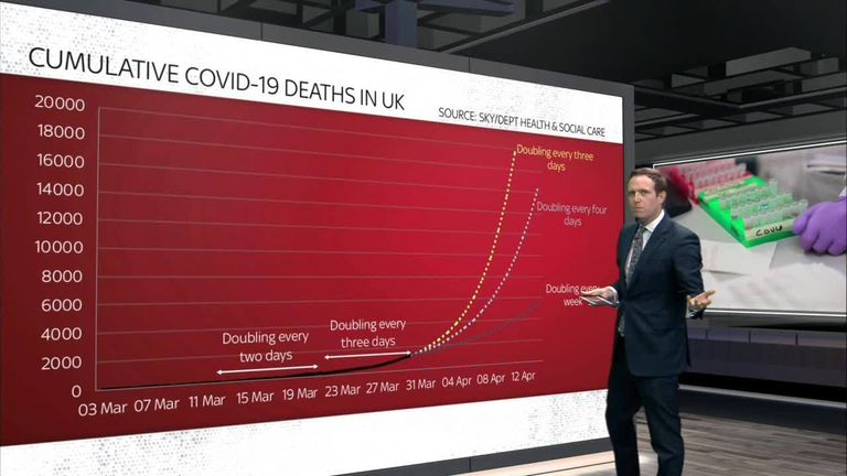
Within a week or so of the first death, the number of deaths was doubling every two days. For the past week or so it's been doubling every three days. To put that into context, if the growth rate continued like that, in a week's time there would be 10,000 people dead and the UK would be on a far worse trajectory than Italy.
That is the dismal logic of exponential growth. It looks small to start with but, by the time you've got your head round it, the numbers are multiplying at a terrible rate.
And this is all before one considers the very real threat of the health system being overwhelmed.

But by the same token, a small change in the growth rate can make an enormous difference. Consider the chart above: if the numbers of people doubled every week rather than every three days, suddenly the outbreak is far, far smaller and the number of people dying is likewise much, much lower.
So what matters more than anything is detecting those rapid growth rates as early as possible. Then you can deal with your problem before it becomes an overwhelming problem.
Focus not on the absolute numbers, but on the growth rate.
And data visualisers have a nifty trick for this: logarithmic scales. Ignore the complicated term: this is just a way of converting a line which looks like it's rising terrifyingly into the sky to one where you're representing the growth rate.
The chart in logarithmic form has the same data. Same annotations. But the steepness of the line is a reflection not of the absolute levels of people dying but the rate at which those levels are increasing.
So actually Britain's death numbers increased most sharply at the beginning but they are a bit flatter now. And you can see that if the numbers double each week, the curve flattens massively.
This is why people keep talking about "flattening the curve". It's about getting those growth rates down.
The good news is that this is possible. The bad news is that these growth rates are quite hard to reduce.
Consider the situation around Europe. A normal chart will show you cumulative deaths in various EU countries and you might have been left with the impression that, indeed, the problem in Spain and, especially, Italy, are far greater than for anywhere else.
At first glance, it's not altogether clear that the UK is heading in that direction. Germany looks to be completely fine, as does the Netherlands.
And while the US death numbers are climbing, they are well below Spanish and Italian levels. But now let's take the same data, those same lines, and change the vertical axis so we're depicting growth rates rather than levels.
Now, all of a sudden you can see that the majority of European countries, and the US, are heading in precisely the same direction.
Spain's problem looks even worse than Italy's - which it is. The Spanish growth rate has outpaced the Italian at every stage of the disease.
But because the disease struck Italy first and because the numbers of people dying in Lombardy are so awful, many people have failed to realise that we are all heading in the same direction.

But looking at the chart, which simply plots each country's COVID-19 cumulative death numbers from the moment each of them passed 100 deaths (that's when that initial super-fast growth rate had diminished) it's clear, depressingly clear, where most of us are heading.
I have been charting the numbers each day for the past few weeks, hoping desperately that something might change: that perhaps the UK's growth rate might start to drop, meaning we start tracking, for instance, South Korea, where the disease does indeed seem to have been suppressed, so far at least.
But each day the death number has been depressingly predictable. Britain is simply following Italy's path, but we are about 15 days behind them.

The good news is that there are some signs that lockdown measures make a difference. Perhaps you can see on this final chart that both Italy and Spain's growth rates have flattened out in the past week or so.
The bad news is that it has taken about a fortnight for those growth rates to level out. Britain has been locked down for a week so if Spain's experience is anything to go by it might take another week or so for the UK line to flatten out.
This might seem depressing but this is the message the data is telling us. That is why the government is doing unprecedented things to flatten those curves above: the sooner they act, the sooner they can arrest a terrifying compound increase which in practice means many more people dying.
The other bit of good news is that there is nothing totally inevitable about these lines. Some countries have managed to keep their growth rates low - consider South Korea and Japan. But other countries have not.
The US is currently a week behind Spain. Germany is a week behind the US. Sweden is about five days behind Germany.

A final note about the data. Yes: the numbers here are by no means definitive and there are lots of provisos.
The definition of a COVID-19 death differs between countries - there is no standardised measure of deaths. Some countries are including all deaths with COVID-19, others, the UK included, is only initially reporting those in hospitals.
The numbers aren't adjusted for population, which often matters with macro data, but in this case doesn't seem to change the paths we're seeing. Eventually they will become population dependent but that doesn't seem to be happening yet.
Finally, there are question marks over the reliability of China's data.
These are all important questions worth pondering. But they make little difference to the big picture we're seeing in this chart: that the UK and other European countries are facing growth rates in this epidemic that suggest within a week or two the number of people who have died will be in five figures rather than four.
I hope to God I'm wrong about that. But that's what the data is suggesting.