At GDS we design based on user needs and always try to keep things as simple as possible for the user. We often say that design shouldn’t interfere with the user journey – except for when the user needs it to. In this piece I’m going to give you an example of what we mean by that.
Cross-service products and components
Part of our work is building a set of shared products and components that make services across government easier to create and cheaper to run. This includes things like GOV.UK Notify, GOV.UK Pay and GOV.UK Verify. These products will eventually be used by many people when they interact with government services online.
Some of these product names will only be used internally and will never be visible to users of government services. Basically, they don’t need to know they’re using them.
However, sometimes there are reasons why we'd want to interrupt a user’s journey – to signal to them that they're using a specific product. Here's an example of one of those occasions.
GOV.UK Verify: when design should get in the way
The most significant of these cross-service products in terms of user interaction, is GOV.UK Verify. It enables users to prove who they are online, so that they can use services on GOV.UK safely.

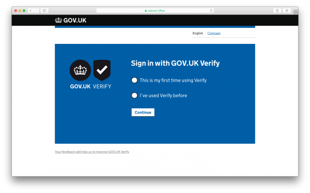
GOV.UK Verify sign in page
In this case, we made the GOV.UK Verify product visible to users because they need to recognise whether this is a thing they’ve already encountered on another service (and perhaps created an account with) or not. We want to prevent people needlessly verifying their identity multiple times.
The initial UI when interacting with GOV.UK Verify is designed in a way that is noticeably different to a standard GOV.UK page. The page is blue and we highlight that GOV.UK Verify is a thing they need to interact with to use the service.
GOV.UK Verify also asks its users to input sensitive information through certified companies. It takes them out of their standard service user journey and on to a third-party site. These Verify-branded elements are therefore also needed for the certified company journey to give a stronger sense of trustworthiness throughout the whole process.
GOV.UK Pay and GOV.UK Notify: when the user doesn’t need to know
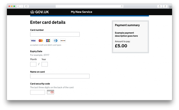
When working on GOV.UK Pay we realised any form of product recognition was unnecessary. In a user’s mind paying for something is part of the service. The payment pages should feel part of the transaction, no matter what government service you are paying for.
There is no need to show the product name ‘GOV.UK Pay’ to service users. It would draw the user’s attention unnecessarily to the fact they were in a separate payment product.

GOV.UK Pay ‘Enter card details’ page
The same reasoning goes for GOV.UK Notify. When a user gets a notification regarding their application, they see that notification as coming from the GOV.UK service they used. They don’t need to know the message is coming from a notifications product called GOV.UK Notify.

A sample GOV.UK Notify message
Only show the user what they need to know
Generally a user shouldn’t need to know what part of government does what in order to interact with it.
We already have a lot of brand recognition and trust built up with the crown and crest, so we shouldn’t dilute this with more branded elements.
The goal is always to keep the experience as simple as possible for users. Graphic design consistency really helps with this.
We should only add product signalling if there is a clear user need. In the case of GOV.UK Verify we know through research there is a need to do this. For Pay and Notify we know there isn’t.

4 comments
Comment by Ziv Lazar posted on
One comment about the SMS notifications is that it's not clear from the example shown what application it is referring to or who sent the message.
Comment by Robin posted on
+1 to that. A revised image that calls out the fictional context of the message would improve the example tremendously.
Comment by Stephen McCarthy posted on
Hi Robin and Ziv – I have updated the image to show a more realistic message. Thanks for your comments.
Comment by Rash Ed posted on
I wish our gov should take step like this....
I am from India and this is really a very good idea. Too much helpful and trustworthy.