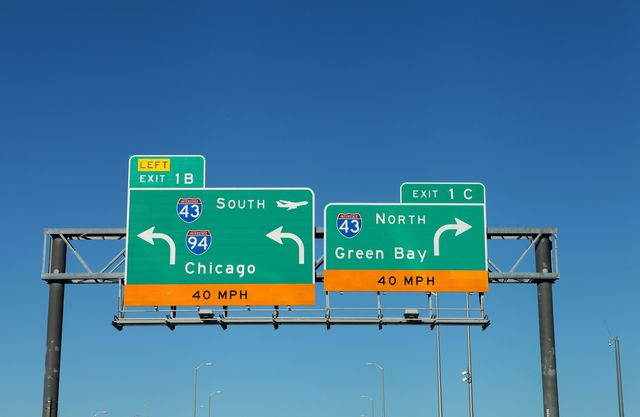
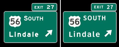
In 2004, the Federal Highway Administration (FHWA) announced its "Interim Approval for Use of Clearview Font for Positive Contrast Legends on Guide Signs," allowing states to change the prevailing font on road signs, Highway Gothic, to a font called Clearview if they chose. Studies suggested that Clearview was easier to read than Highway Gothic, especially in the dark, and about 30 states updated their highway signs as a result.
That "Interim Approval" of Clearview was suddenly terminated on Monday, according to a notice posted on the Federal Register by the FHWA. This means that any new signs must use Highway Gothic again, though existing signs with Clearview do not need to be replaced as long as they are in good condition.
Among some circles, this decision represents a major lapse in judgement. Studies conducted by the Pennsylvania Transportation Institute and the Texas Transportation Institute found that drivers could read Clearview as much as 80 feet farther away than they could read Highway Gothic, which was developed in the 1940s. The test was conducted at 45 mph, which means drivers had 1.2 seconds longer to read the signs with Clearview font.
"Helen Keller can tell you from the grave that Clearview looks better," Donald Meeker, one of the designers of the Clearview font, told City Lab.
Meeker's firm, Meeker & Associates, worked with the Pennsylvania Transportation Institute to conduct tests on Clearview. As its name suggests, Clearview was designed specifically to be as legible as possible. The primary difference between Clearview and Highway Gothic is that Clearview has larger interstices, or internal spaces, in letters such as the lowercase e, a, and s.
But a spokesperson told City Lab that more research in the past decade has led the FHWA to decide that the Clearview font is less legible than Highway Gothic on signs with "negative-contrast color orientations," including Speed Limit and Warning signs that have black font on either a white or yellow background. The FHWA also suggested that Clearview may be harder to read on Street Name signs.
As City Lab points out, switching to Clearview requires municipalities to purchase a standard license for the font—$175 for one font and up to $795 for the entire typeface family of 13 fonts—so cost might be a factor in the FHWA's decision. As it stands, the country's signs are a combination of Clearview and Highway Gothic, with some instances of cities changing to Clearview while the state stuck with Highway Gothic. But as old signs deteriorate and are replaced, Clearview will be phased off of American roads. At least we'll be able to see it coming.
Source: City Lab

Jay Bennett is the associate editor of PopularMechanics.com. He has also written for Smithsonian, Popular Science and Outside Magazine.


