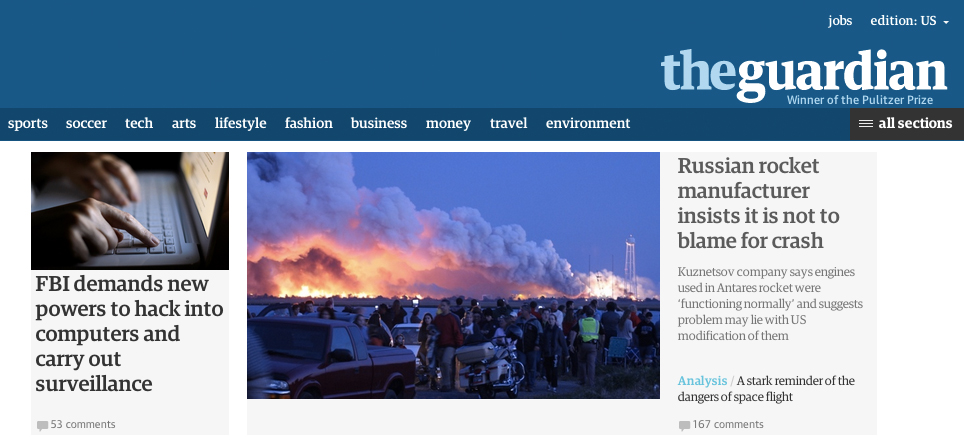
After months of beta testing and a continuous flow of reader feedback, The Guardian has unveiled a new homepage for its American audience. The new Guardian U.S. homepage has been radically changed to improve usability and performance for its 27 million unique visitors (up 30 percent year-over-year for September).
The move comes as some pundits have declared the homepage “dead” — and even as some publishers fight off the decline of their own homepage traffic through increasingly desperate means. But the Guardian U.S. is doubling down. One new innovation is the implementation of a so-called “flexible ‘container’ format” that looks like a miniature homepage in a vertical, banner-like form. The new system enables editors to more easily respond to breaking news and updated stories. The modular design also translates well to mobile.
The Guardian News Media has had a core team of 40 working on its next generation sites over the last 18 months. Wolfgang Blau, GNM’s digital strategy director, explained the strategy behind the redesign. (Full disclosure: I used to work for GNM) Excerpts:
What’s behind the redesign?
The last site was built at a time when the majority of users only went online for extra analysis — not for news itself. There was a need for one unified site for all devices, as well as the need to cater to new content formats and commercial requirements. We publish around 500 stories a day. This new site helps users identify different kinds of stories, by style, tone and relative importance.
Like a newspaper?
Right. The simple list view still dominates most news sites: there’s either a vertical or chronological hierarchy of importance. We wanted to offer more nuance and assign levels of importance. The new site offers different headline and picture sizes to do this. There are also visual clues for types of stories with our new color scheme. Red is for news, purple for features, yellow for comment, black for multimedia and so on. Our tests show that users are responding well to these subtle indicators.

What was the biggest challenge in overhauling the site?
We’ve designed it in the open, which has been fantastic but also very challenging. Users and colleagues take a beta version of the site at face value — if something’s wrong, they think it’ll be like that forever. We’ve had 25,000 comments, and sometimes we’ve had to reassure them it’s not the final version. But overall, the benefits far outweighed the risks — such as revealing too much to competitors. We have even published a lot of our work on github.
People are saying the homepage is dead. How did that impact the redesign?
The concept of the homepage is broken. Sites are still broadcasting one homepage for everyone, and they’re designed to reflect the structure of the newsroom, not the user journey. Our container layout will allow for greater personalization and content recommendations within the article page. Having said that, this September 31 percent of all visitors to theguardian.com also navigated to our home page, so the homepage isn’t quite dead just yet.
How did you factor in commercial considerations?
The ad industry is moving toward time-based metrics, so the new site gives us the ability to offer that. The modular page design also allows us to insert more high-impact, full-screen ad formats across the site. Previously, we’d only been able to show these formats above or below an article, or on the homepage.
Why redesign the U.S. homepage ahead of the U.K.’s?
The U.K. version of the site is taking a little longer while we work with our commercial departments, like our dating platform, Guardian Soulmates, and Guardian Jobs, to make sure the new site helps meet their aims.
The new site is four times faster, but why does a millisecond here or there matter?
Readers might not even notice page-load time consciously, but research has shown time and time again that it has a big impact on user satisfaction and loyalty. It’s also a question of SEO. Google favors fast sites.


More in Media
Walmart rolls out a self-serve, supplier-driven insights connector
The retail giant paired its insights unit Luminate with Walmart Connect to help suppliers optimize for customer consumption, just in time for the holidays, explained the company’s CRO Seth Dallaire.

Research Briefing: BuzzFeed pivots business to AI media and tech as publishers increase use of AI
In this week’s Digiday+ Research Briefing, we examine BuzzFeed’s plans to pivot the business to an AI-driven tech and media company, how marketers’ use of X and ad spending has dropped dramatically, and how agency executives are fed up with Meta’s ad platform bugs and overcharges, as seen in recent data from Digiday+ Research.

Media Briefing: Q1 is done and publishers’ ad revenue is doing ‘fine’
Despite the hope that 2024 would be a turning point for publishers’ advertising businesses, the first quarter of the year proved to be a mixed bag, according to three publishers.